


SEJournal Online is the digital news magazine of the Society of Environmental Journalists. Learn more about SEJournal Online, including submission, subscription and advertising information.
May 12, 2021

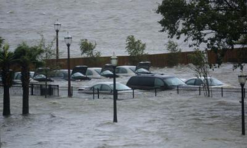 |
| In downtown Mobile, Ala., cars submerged by the storm surge from Hurricane Katrina on August 29, 2005. Photo: au_tiger01, Flickr Creative Commons. Click to enlarge. |
Reporter’s Toolbox: Storm Surge Maps Help Envision Potential Hurricane Flood Catastrophes
By Joseph A. Davis
The coming of summer will bring hurricane season and the possibility of serious disaster — especially along the Atlantic and Gulf coasts of the United States.
With hurricanes, the worst destruction often comes from water rather than wind. And the worst water damage often comes from storm surges.
So heeding storm surge warnings, even miles inland, can save your audience (not to mention you as an environmental journalist covering the storm).
Evacuation saves lives. This is not theoretical.
In 2002, three years before Katrina hit New Orleans, John McQuaid and Mark Schleifstein published the “Washing Away” series in The Times-Picayune. The resulting evacuation planning probably saved tens of thousands of lives.
McQuaid and Schleifstein used storm surge maps.
So if you face a looming hurricane, there is a data-based map for that.
Where the data comes from
The National Hurricane Center, or NHC, has had two decades since Katrina to develop, detail and improve the set of surge maps.
The NHC is a unit of the National Oceanic and Atmospheric Administration, and works with other federal agencies, including within NOAA, to develop the maps, the data and the computer models that underlie them.
One good place to start exploring this system is the National Storm Surge Hazard Maps.
But during an actual storm, your best bet would be to follow real-time advisories from the NHC, and from your state and local emergency management agencies. NHC may do separate surge advisories.
What is storm surge?
Before you encounter a 15-foot wall of water, it is good to understand what makes a storm surge.
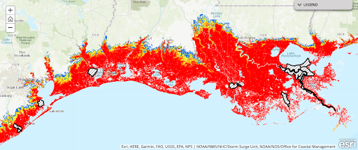 |
| Simulations of storm surge impacts for a category 5 hurricane along the Gulf Coast between Houston and New Orleans. Image: National Hurricane Center, National Storm Surge Hazard Maps. Click to enlarge. |
To simplify, a strong wind pushes the surface layer of exposed water, sliding and piling it up higher than normal in the places toward which it is blowing.
Atmospheric pressure differences between one area and another (hurricane eyes are very low pressure) amplify the effect, making water rise where the pressure is lower.
Topography of seafloor and coastal land is also key. As land slopes up, it further amplifies surge. Barriers to water movement (like a seawall, road or levee) can further amplify, reflect or reduce surge, sometimes focusing it as a lens would. It’s complicated.
These complexities are why computer models can help forecast storm surge. The NHC maps use a model called SLOSH (“Sea, Lake, and Overland Surges from Hurricanes”). It is the descendant of a model that McQuaid and Schleifstein used in their series.
And the NHC’s maps are generated with the model, along with various data inputs like tidal status, wind speed, pressure, etc.
How to use the data smartly
NHC’s surge maps are in sets covering four areas: Texas to Maine, Puerto Rico/U.S. Virgin Islands, Hispaniola and Hawaii. You view them using an interactive ArcGIS map viewer, so you can zoom in to a rather fine level. It generates a map for each category of hurricane intensity (1 through 5). The maps are color-coded to show how high surge water can be expected to rise.
Remember that these maps are not “real-time” indications of risk. They may be fine for contingency planning — whom to warn, how to evacuate, where to go, etc.
But in a real emergency, the experts at NHC will be running the models with all the quirky, unique variables and attributes of a particular storm and place.
Listen to your local emergency agencies, the NHC advisories and evacuation orders for your particular time and place. Also note the funny gaps on the maps. These represent leveed areas. If you remember Katrina, you may not want to bet your life on the proposition that you are safe in a leveed area.
Incidentally, one other useful data product is a set of storm surge maps produced by the U.S. Environmental Protection Agency, for “resiliency” purposes. Those might include things like water and sewage treatment plants, Superfund sites, petrochemical plants, power plants and other environmental facilities that may be vulnerable to surge flooding.
This is all stuff environmental journalists may find worth investigating and writing about before the storm surge hits.
[Editor’s Note: SEJ has compiled related resources on this Hurricane Issues page].
Joseph A. Davis is a freelance writer/editor in Washington, D.C. who has been writing about the environment since 1976. He writes SEJournal Online's TipSheet, Reporter's Toolbox and Issue Backgrounder, as well as compiling SEJ's weekday news headlines service EJToday. Davis also directs SEJ's Freedom of Information Project and writes the WatchDog opinion column and WatchDog Alert.
* From the weekly news magazine SEJournal Online, Vol. 6, No. 19. Content from each new issue of SEJournal Online is available to the public via the SEJournal Online main page. Subscribe to the e-newsletter here. And see past issues of the SEJournal archived here.
SEJ Publication Types:
Topics on the Beat:
Region:
Visibility: